Management demo

CardioTwin TR

A realistic product concept for tricuspid repair training and planning simulation, built from the Cardioband paper, Wolfram notebooks, and a PyQt6 dashboard.

Product conceptMathematica simulationDesktop appTraining workflow
← Swipe to navigate →

Goal

Show Edwards management what the next phase could look like: not just a paper analysis, but a product-like simulator that makes annular reduction, risk, and outcome response understandable.

Positioning: training/product discovery simulator — not clinical decision support.
Product concept

What CardioTwin TR does

1

Enter anatomy

Baseline annular diameter and expected annular reduction.

2

Select severity

Severe, massive, or torrential baseline TR.

3

Add risk

RV risk and bleeding-risk categories.

4

Simulate

Estimate response, KCCQ gain, and risk.

5

Train

Use synthetic cohorts and plots for education.

The product turns static aggregate evidence into an interactive scenario simulator.
Evidence anchor

Calibrated to the paper’s headline numbers

21.3%annular reduction
73.1%TR ≤ moderate
19.0KCCQ gain
35.1%bleeding reference

The simulator does not invent a new clinical claim. It starts with the public aggregate paper results and makes the mechanism explorable.

Mathematica foundation

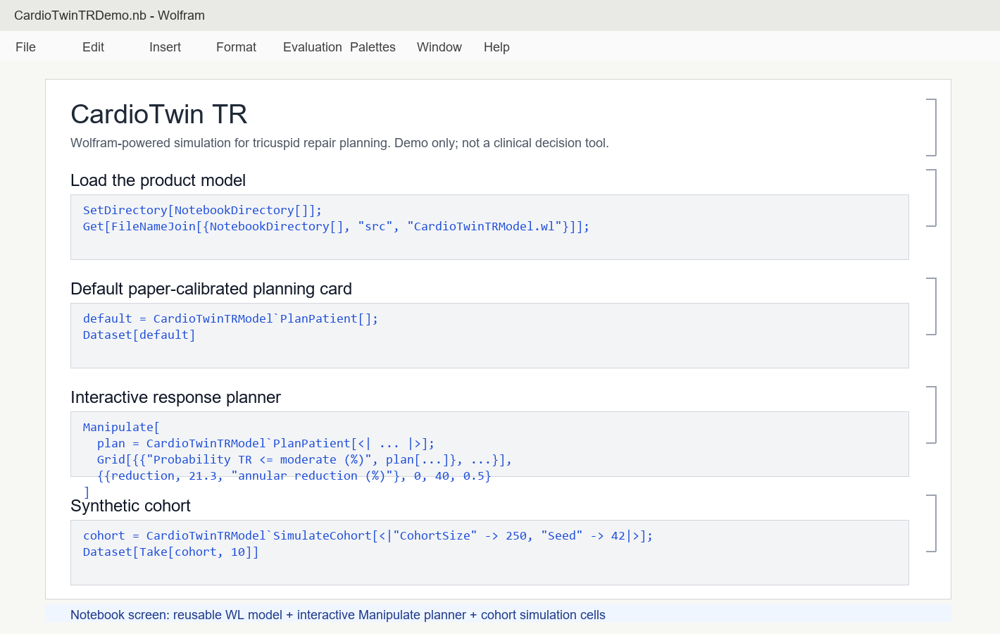
The notebook is the scientific workbench

The Wolfram notebook demonstrates the transparent model, interactive Manipulate planner, response curve, synthetic cohort generation, and export pipeline.

This keeps the product grounded in an inspectable computational model before moving to a polished management-facing app.

CardioTwin TR Mathematica notebook screen
Desktop product phase

The dashboard looks like a real product

The PyQt6 app provides a management-ready product experience: navigation, metric cards, plots, planning outputs, cohort simulation, and validation messaging.

It is designed so a short video can show the business value in under five minutes.

CardioTwin TR dashboard screen
Usage step 1

Start with the Executive Dashboard

Open the app and begin with the top-line story: predicted response, expected KCCQ gain, final annular diameter, and plain-language recommendation.

This is the opening screen for management: it communicates the product purpose immediately.

Executive dashboard
Usage step 2

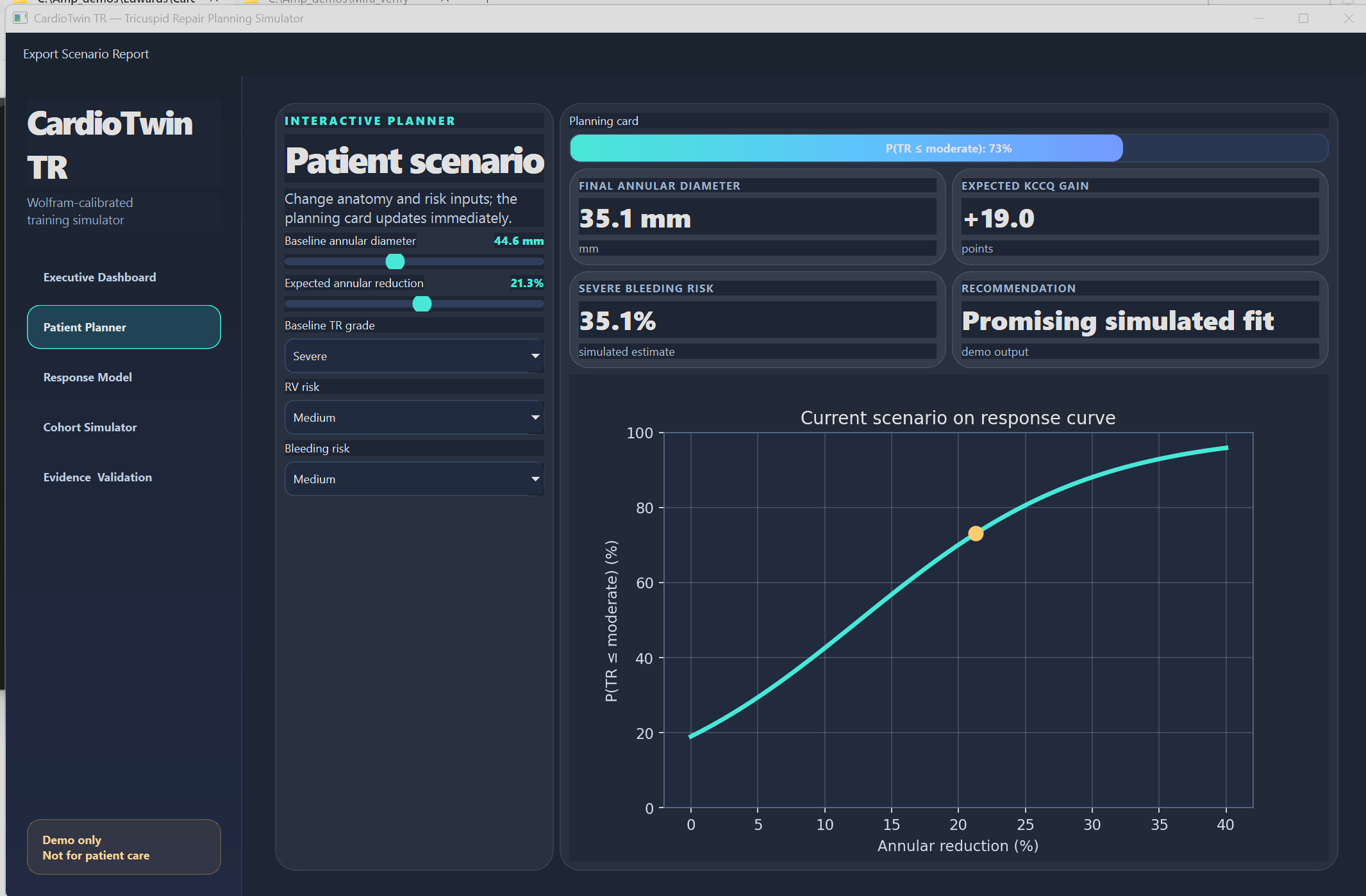
Adjust the planning scenario

In Patient Planner, move the annular reduction slider and change TR grade, RV risk, or bleeding risk.

The planning card updates immediately, showing how anatomy and risk assumptions change the predicted outcome.

Patient response planner screen
Model view

Explain response with a curve

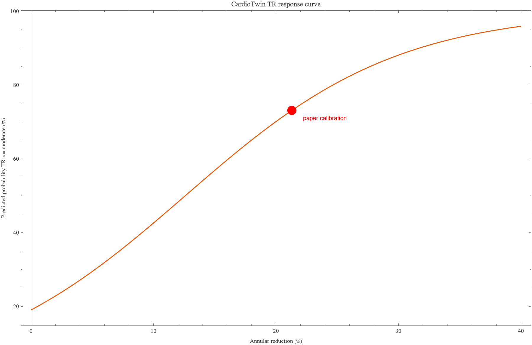
The response curve shows why annular reduction matters. The paper calibration point is the anchor; the curve explains what happens when the expected reduction is lower or higher.

Annular reduction % → probability of TR ≤ moderate → expected KCCQ gain
Response curve
Risk view

Show why patient risk matters

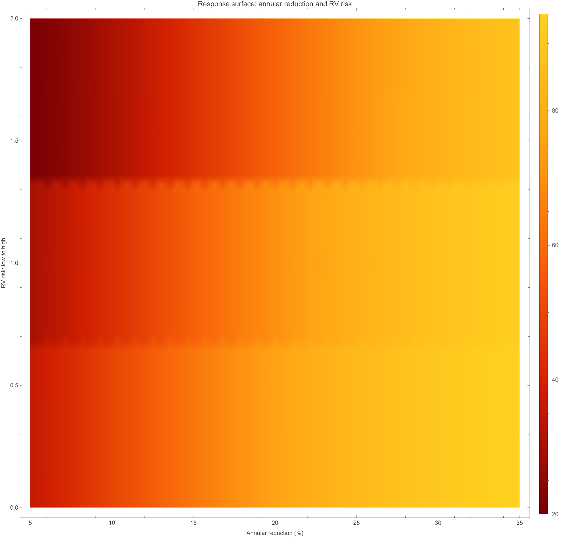
The response surface communicates a more realistic training message: annular reduction improves probability, but RV risk changes the expected response.

This is valuable for education because it avoids a one-size-fits-all interpretation.

Response surface
Usage step 3

Generate a synthetic cohort

The Cohort Simulator creates synthetic patient rows for training scenarios. These are not real patients, but they let a team discuss distributions and variability.

Use this view in the video to show the app acting like a serious product, not a static slide.

Cohort simulator screen
Cohort result

Response probability distribution

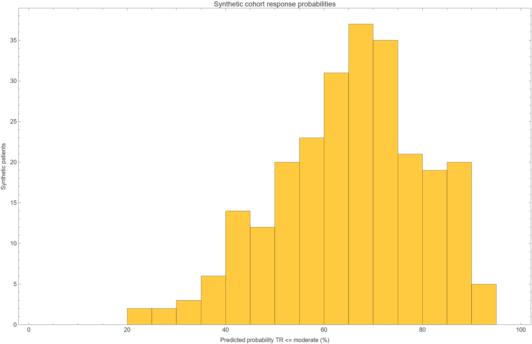
A cohort view makes the product suitable for training: instead of one patient, users see a spread of predicted responses across a simulated population.

This supports realistic conversations about variability, selection, and expected outcomes.

Cohort response histogram
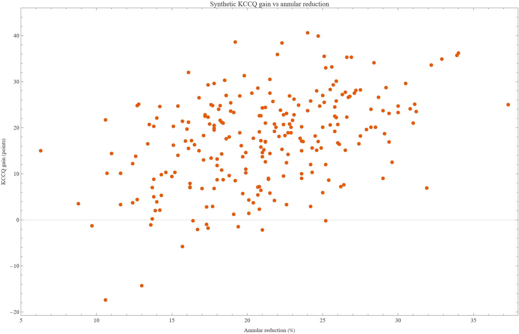
Patient-centered outcome

KCCQ connects engineering to patient benefit

The app does not stop at device mechanics. It connects annular reduction to quality-of-life improvement using the paper’s KCCQ signal.

This is the bridge between engineering, clinical value, and management storytelling.

KCCQ response vs annular reduction
How to demo it

A simple video flow

  • Open dashboard and introduce CardioTwin TR.
  • Point to the paper-calibrated numbers.
  • Move annular reduction down and up.
  • Change TR grade and RV risk to show sensitivity.
  • Open response model and cohort simulator.
  • Close on validation and limitations.

Suggested message

“This turns an Edwards-related paper into a realistic training product that makes response, risk, and quality-of-life outcomes interactive.”

What it is not

Keep the claims safe

CardioTwin TR is not a medical device, diagnostic system, or validated clinical decision-support tool.

It is a training and product-discovery simulator calibrated to aggregate published evidence and synthetic cohorts.

Next phase if Edwards is interested

  • Connect patient-level trial or registry data.
  • Add CT/TEE imaging-derived anatomy features.
  • Validate predictions prospectively.
  • Package training modules for field and clinical teams.
Takeaway

From notebook to management-ready product demo

  • Wolfram notebook provides the scientific simulation layer.
  • PyQt6 dashboard provides a realistic product interface.
  • Synthetic cohorts make training and video storytelling possible.
  • The product concept is commercially plausible while staying scientifically honest.

CardioTwin TR

A credible next phase: paper → model → notebook → desktop product demo → management conversation.

1 / 15